
Mobile‑Friendly Web Design - Solution Web Designs
Mobile-Friendly Website Designers
Serving Small and Mid‑Sized Businesses in Manhattan, NYC, The Boroughs, Long Island, and Nationwide Since 1998
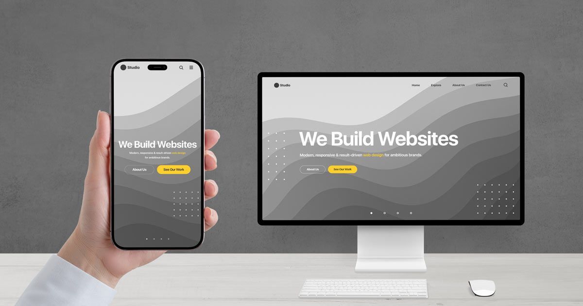
Your customers are using their phones more than ever, and your website needs to deliver a clean, easy‑to‑use experience on every screen. A mobile‑friendly website is no longer optional, and visitors expect pages that load quickly, display correctly, and make information simple to find. Solution Web Designs builds modern, mobile‑friendly websites that help your business look professional, communicate clearly, and convert more visitors into customers.
Why Mobile‑Friendly Web Design Matters
A mobile‑friendly website ensures that your business is easy to interact with on any device, whether someone is browsing on a smartphone, tablet, laptop, or desktop. Customers expect a smooth experience, and they will leave quickly if your website is difficult to read or navigate.
A mobile‑friendly design helps you make a strong first impression and keeps visitors engaged long enough to learn about your services.
Designed for Today’s Mobile Users
Most visitors will view your website on a mobile device, and your website must be built with this behavior in mind. A mobile‑friendly design adjusts automatically to different screen sizes, ensuring your content remains readable and your layout stays organized. This creates a more enjoyable experience for your visitors.
A Better Experience for Every Customer
A mobile‑friendly website improves readability, reduces unnecessary scrolling, and makes it easier for customers to find what they need. This helps visitors stay focused on your message and encourages them to explore your services. A clean, mobile‑friendly layout also builds trust by showing that your business is modern, organized, and attentive to customer needs.
Clean, Modern Design That Supports Your Message
Your website should communicate your message clearly and help visitors understand what you do within seconds. We design websites with clean layouts, simple navigation, and professional visuals that support your content and make your business look credible. Every design decision is made to help visitors feel confident in choosing your services.
- Easy Navigation for All Devices - Visitors should never struggle to find information, especially on a phone. We create navigation that is simple, intuitive, and easy to use on small screens. This helps customers navigate your website naturally and reduces the risk of them leaving due to confusion or frustration.
- Layouts That Highlight What Matters Most - A strong layout guides visitors through your content in a clear, organized way. We design pages that highlight your most important information and make it easy for customers to understand your services. This helps improve engagement and encourages visitors to take the next step.

Professional Content That Builds Trust
Clear, accurate content is essential for a successful website. Visitors rely on your content to understand your services, learn about your business, and decide whether to contact you. We write all the content for your website, ensuring it is easy to understand, professionally written, and aligned with your brand.
- Content That Supports Your Goals - Effective content guides visitors through your website and helps them feel confident in choosing your business. We write content that answers common questions, explains your services clearly, and highlights the value you provide. This helps visitors understand your business quickly and encourages them to reach out
- Content That Improves Engagement - Well‑written content keeps visitors on your website longer and encourages them to explore additional pages. This increases engagement and helps build trust, which is essential for converting visitors into customers. Our content is written to be clear, helpful, and easy to read, making your website more effective and more enjoyable for your audience.
Mobile‑Optimized Graphics and Visual Branding
Your website’s visuals play a major role in how customers perceive your business. We create original, licensed graphics that look sharp on all devices and support your brand identity. Every graphic is designed to load quickly, display correctly, and enhance your message without slowing down your website.
- Graphics That Strengthen Your Brand - High‑quality graphics help communicate information quickly and make your website more visually appealing. We design graphics that support your content, highlight important information, and create a more engaging experience for your visitors. Each graphic is created specifically for your business and tailored to your brand.
- Consistent Visuals Across All Screens - Your graphics should look clean and professional on every device. We optimize all visuals to ensure they load quickly and display correctly on phones, tablets, and desktops. This helps maintain a consistent brand experience and ensures your website looks polished wherever customers view it.
Built for Speed, Stability, and Search Engines
A mobile‑friendly website must load quickly and perform reliably. Slow or unstable websites frustrate visitors and hurt your search engine visibility. We build websites with a clean structure, organized content, and modern SEO best practices to improve your visibility and support long‑term growth.
- Fast Loading for Better User Experience - Visitors expect websites to load quickly, especially on mobile devices. We optimize your website to reduce load times and create a smoother customer experience. This helps keep visitors engaged and improves your search engine performance.
- SEO‑Friendly Structure and Best Practices - Search engines prioritize websites that provide a strong mobile experience. We build websites with clean code, logical navigation, and properly formatted content to help search engines understand your pages. This supports your long‑term SEO strategy and helps improve your rankings.
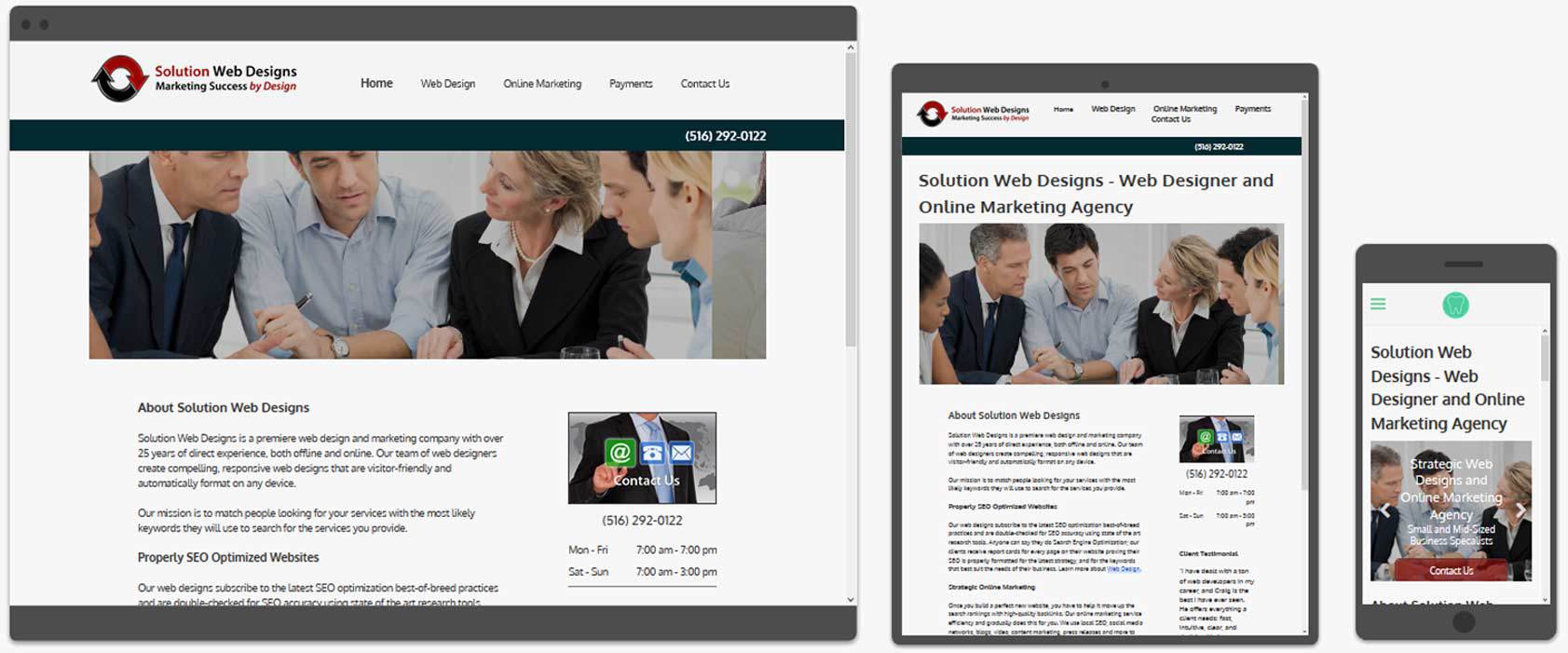
Mobile‑Friendly Web Design Company You Can Trust
Since 1998, Solution Web Designs has helped small and mid‑sized businesses build modern, reliable websites that support long‑term success. We take pride in our work and are committed to creating websites that are clear, professional, and easy for customers to use. Our team handles every part of the process, from design and content to graphics and optimization, so you can focus on running your business.
- A Clear, Supportive Process - We work closely with you to understand your goals, your audience, and the message you want to communicate. This ensures your website reflects your business accurately and provides a strong foundation for your online presence. Our process is organized, transparent, and designed to make the experience as smooth as possible.
- Long‑Term Support and Guidance - Your website is an important part of your business, and we are here to support you long after it launches. We provide ongoing guidance, updates, and recommendations to help your website remain effective as your business grows. Our goal is to be a long‑term partner you can rely on.